Identidad de brød, por 2Y studio
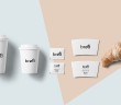
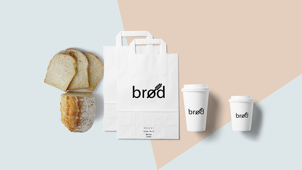
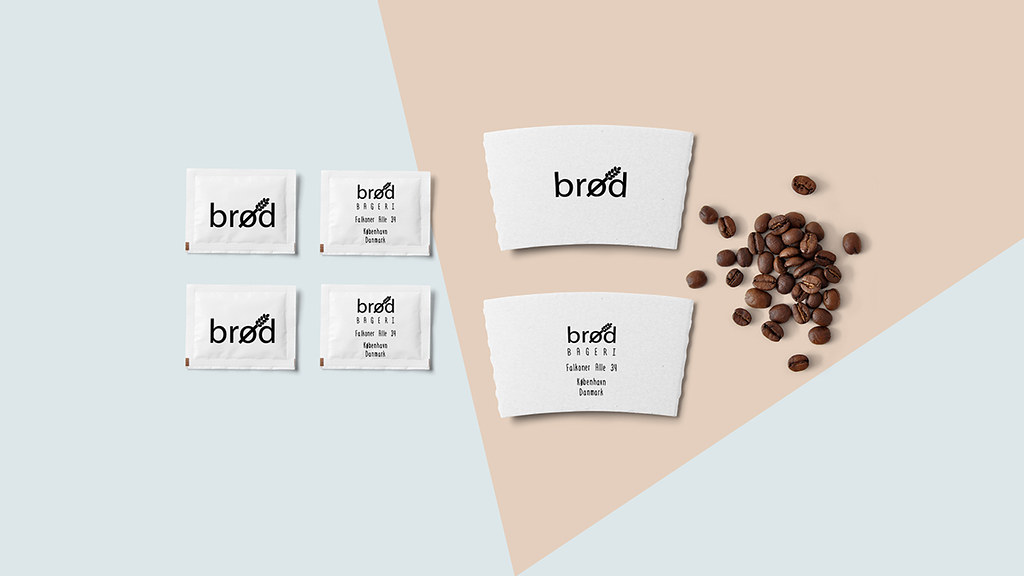
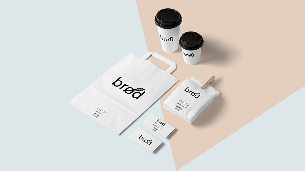
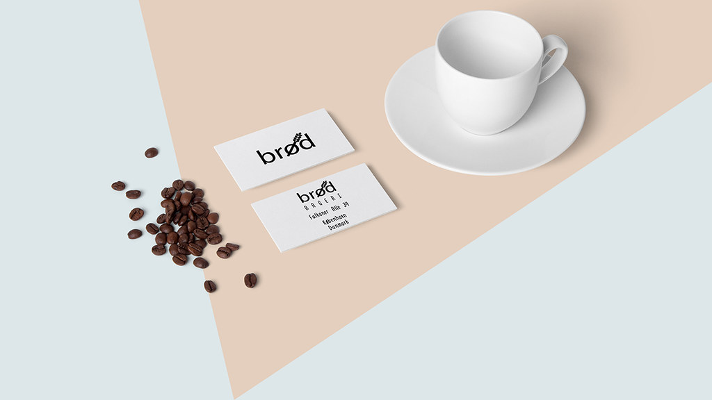
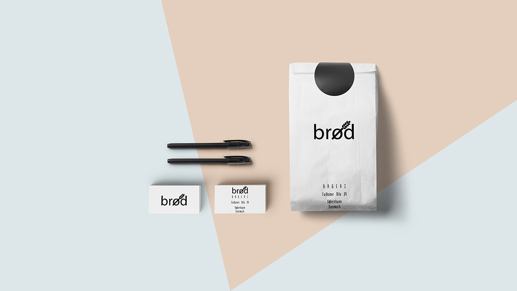
2Y studio ha creado la identidad visual de brød, «una moderna boutique de pan que respeta la tradición del arte del horneado». La palabra brød (pan), con su significado claro y directo y en equilibrio con la racional tipografía del logo (Myriad Pro Regular), evidencia la simplicidad del enfoque adoptado por la identidad. Líneas limpias y nítidas y una paleta acromática son otros de los ejes plásticos del grafismo.
– –
2Y studio is the author of the visual identity for brød, «a modern boutique bakery with respect for the traditions
of the art of baking». The word “brød”(bread) itself with its straightforward meaning in harmony with the no-nonsense typography (Myriad Pro Regular) of the logo implies the simple approach taken by the bakery. Clean and sharp lines and an achromatic palette are another plastic core values of the project.