
Identidad de Burger Station, por Nueve
Nueve (el estudio de diseño y consultoría creado por Ana …
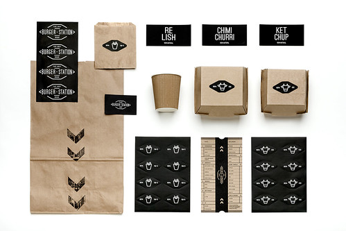
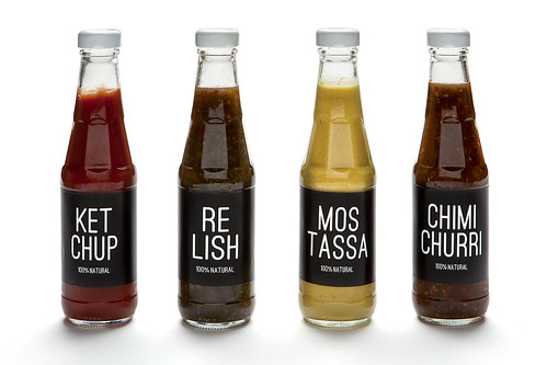
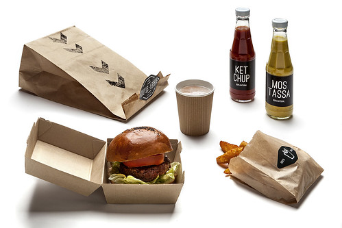
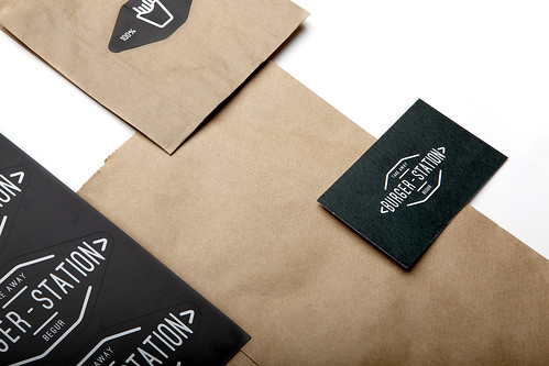
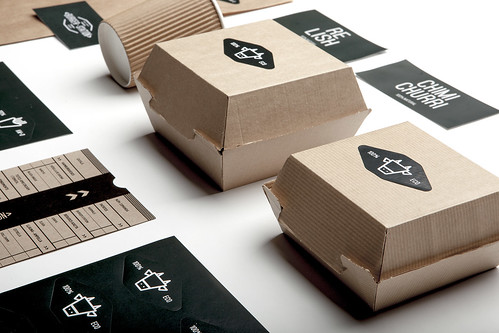
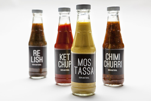
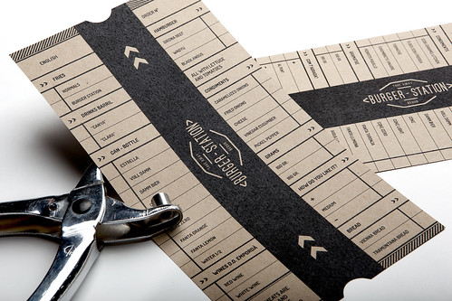
Nueve (el estudio de diseño y consultoría creado por Ana V. Francés y Cristina Toledo) acaba de realizar el rediseño de Burger Station, una cadena de hamburgueserías km.0 que incluye cambio de naming y nueva línea de packaging. Sus ingredientes más importantes, un claro protagonismo tipográfico (mediante la omnipresencia de un palo seco rounded llamado Dosis), una armonía acromática y el carácter casero y artesanal que le otorgan los materiales de cartón.
– –
Identity of Burger Station Nueve (the design studio and consultancy founded by Ana V. Francés and Cristina Toledo) has just launched the redesign of Burger Station, a chain of km.0 burguer bars that include change of namig and new line of packaging. Its more important ingredients, the clear main role of typography (through the omnipresence of a rounded sans-serif typeface called Dosis), an achromatic palette and the homemade and handcrafted style given by the cardboard materials.
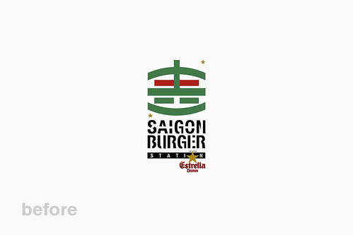
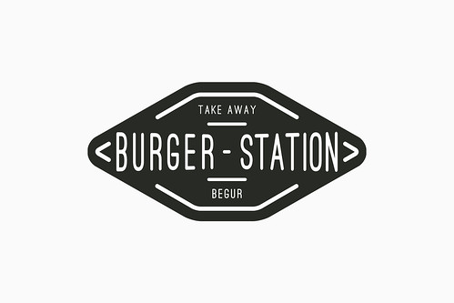
El diseño y el naming del nuevo logo procuran una clara síntesis gráfica y cromática (frente a los excesos anteriores) y buscan abandonar las referencias asiáticas (improcedentes en el concepto km.0), vinculándolo con el universo gráfico de las estaciones de metro.
– –
The design and naming of the new logo look for a clear graphic and chromatic synthesis (in order to avoid the previous excesses) and try to leave the Asian references (that have no sense with the km.0 concept), linking it to the graphic universe of the subway stations.
Realmente bueno.
Un saludo.