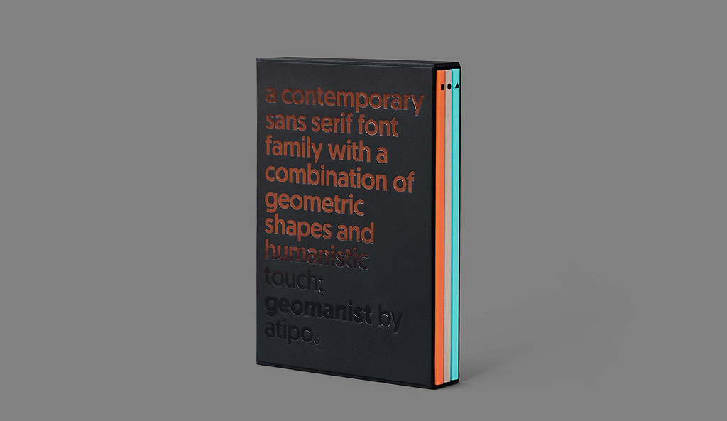
Geomanist, la nueva tipografía de Atipo
De nueve pesos, el formidable estudio asturiano la define como un tipo «contemporáneo sans, limpio y elegante, con una combinación de formas geométricas y un toque humanista».

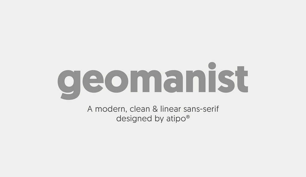
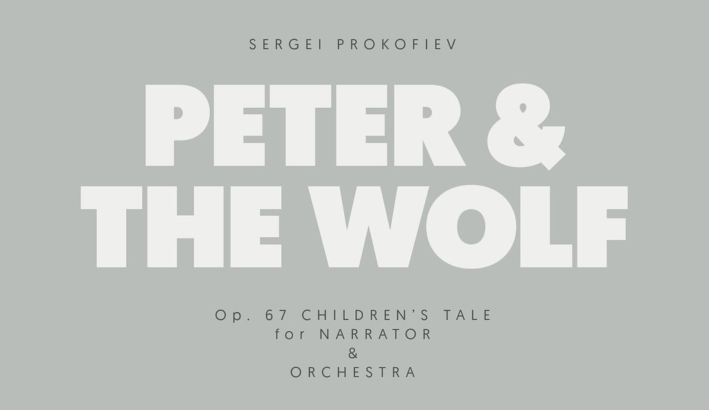
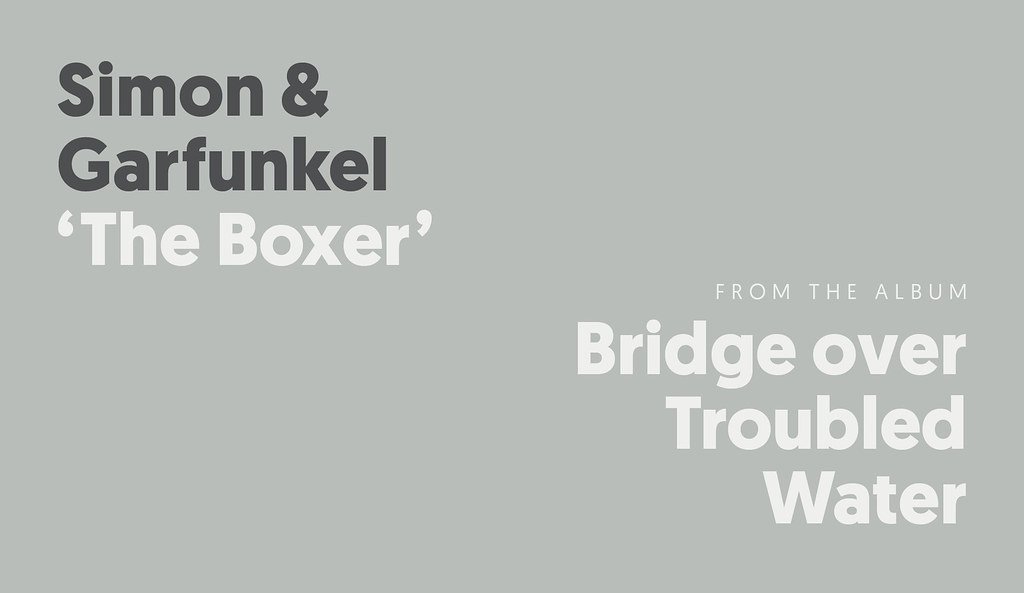
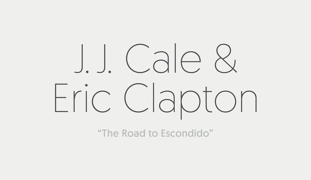
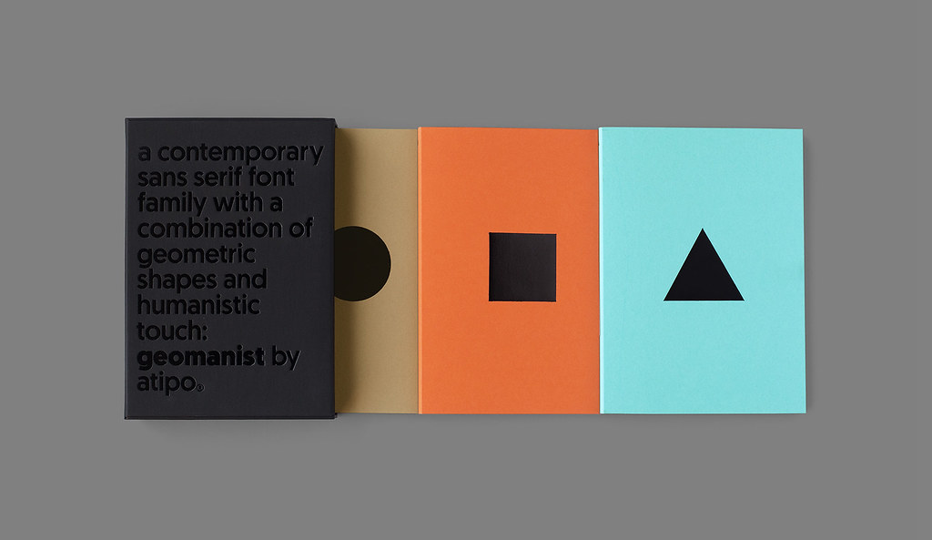
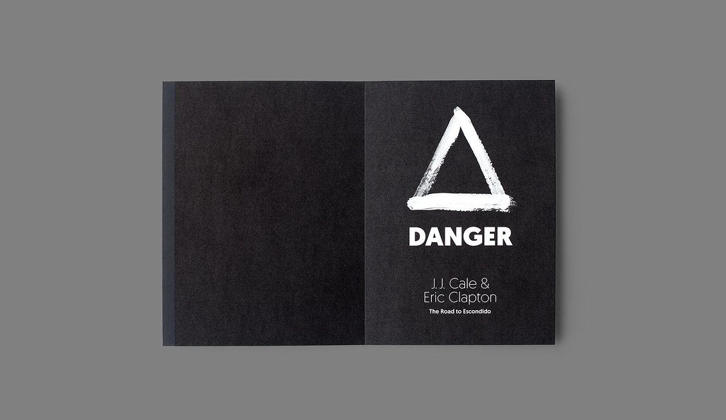
Atipo acaba de lanzar Geomanist, una tipografía «contemporánea sans, limpia y elegante, con una combinación de formas geométricas y un toque humanista», de nueve pesos. Para su promoción, el magnífico estudio asutriano ha diseñado un espécimen cuyo ‘leitmotiv’ es “geometría & ritmo” y que está compuesto por tres libros donde se exploran las posibilidades gráficas de las formas geométricas básicas ligadas a diferentes temas musicales. Los 10 primeros compradores que paguen 100€ por la compra de la tipografía recibirán un espécimen gratis.
Manteniendo la filosofía de anteriores productos, el peso regular puede descargarse pagando con ‘tweet’ o un ‘like’ en Facebook (tanto para escritorio como webfont), y el resto de la familia pagando lo que se quiera.
– –
Atipo has just launched Geomanist, a «contemporary sans-serif font, clean and elegant, with a combination of geometric shapes and a humanist style», with nine weights. For its promotion, the great Asturian studio has designed a specimen whose leitmotiv is «geometry & rhythm», composed of three books that explore the graphical capabilities of basic geometric shapes linked to various musical themes .The first 10 buyers who pay 100 euros for the purchase of this typography will receive a free specimen.
Keeping the same rules of their earlier products, the regular weight can be downloaded paying with ‘tweet’ or ‘like’ on Facebook (both desktop and webFont), and the rest of the family with the «pay what you want» philosophy.