Identidad de Creoquete, por Atipo

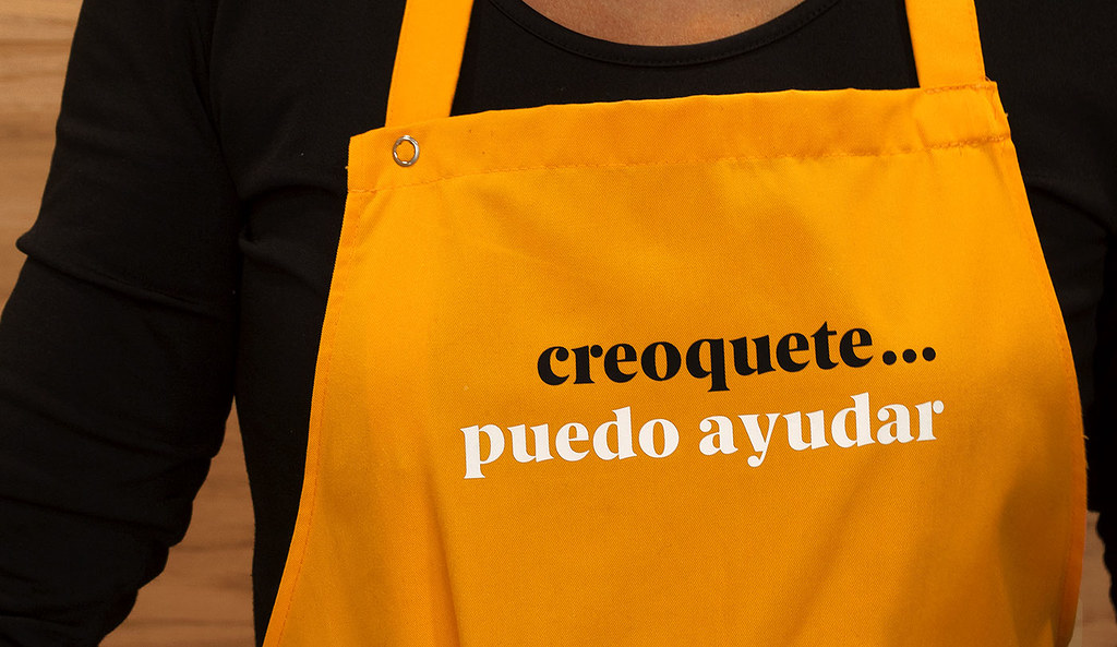
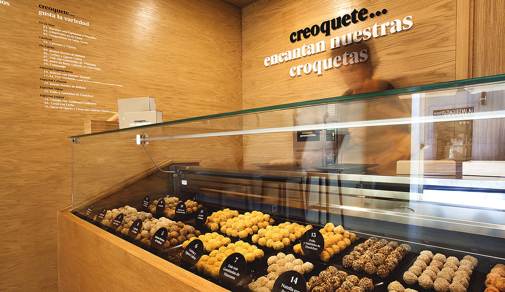
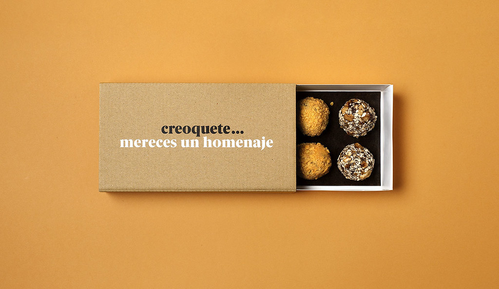
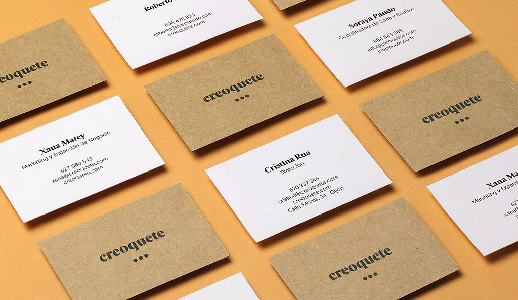
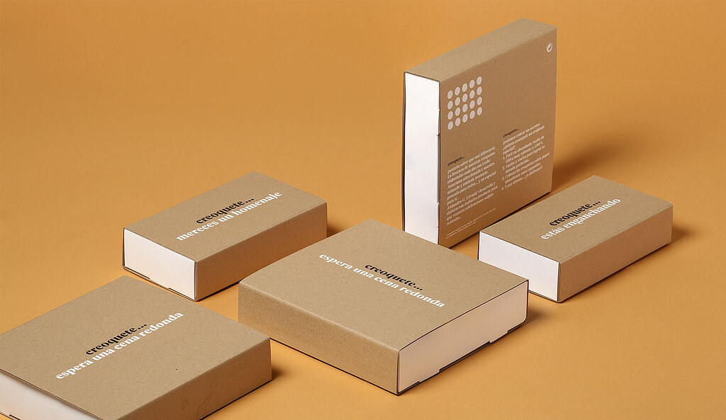
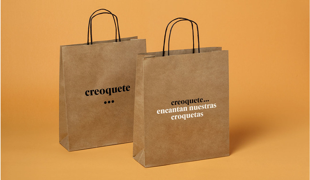
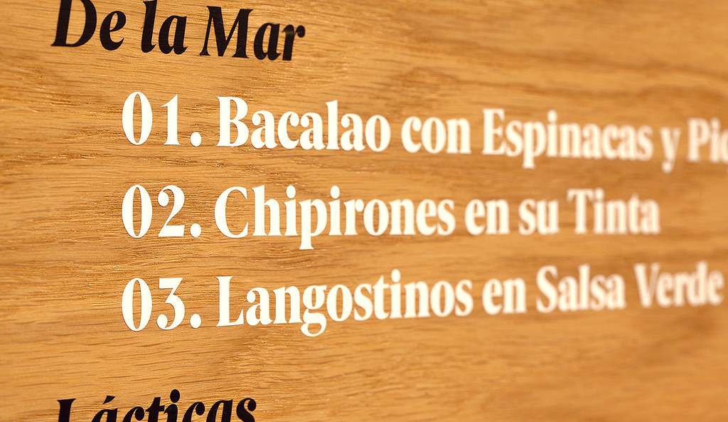
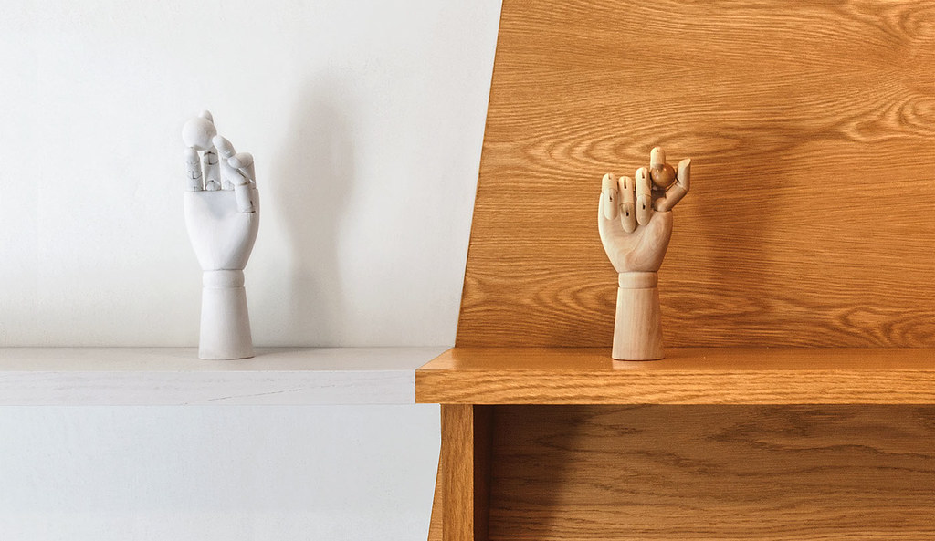
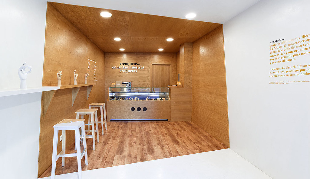
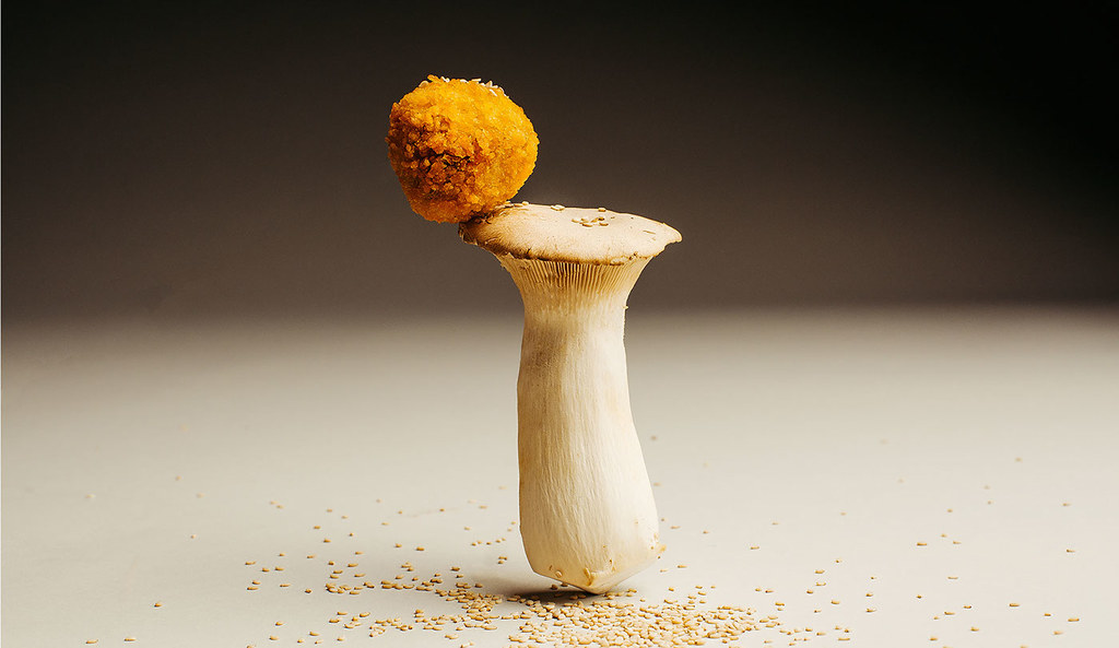
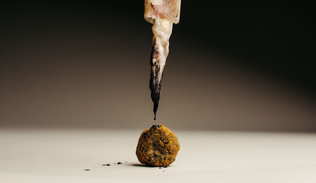
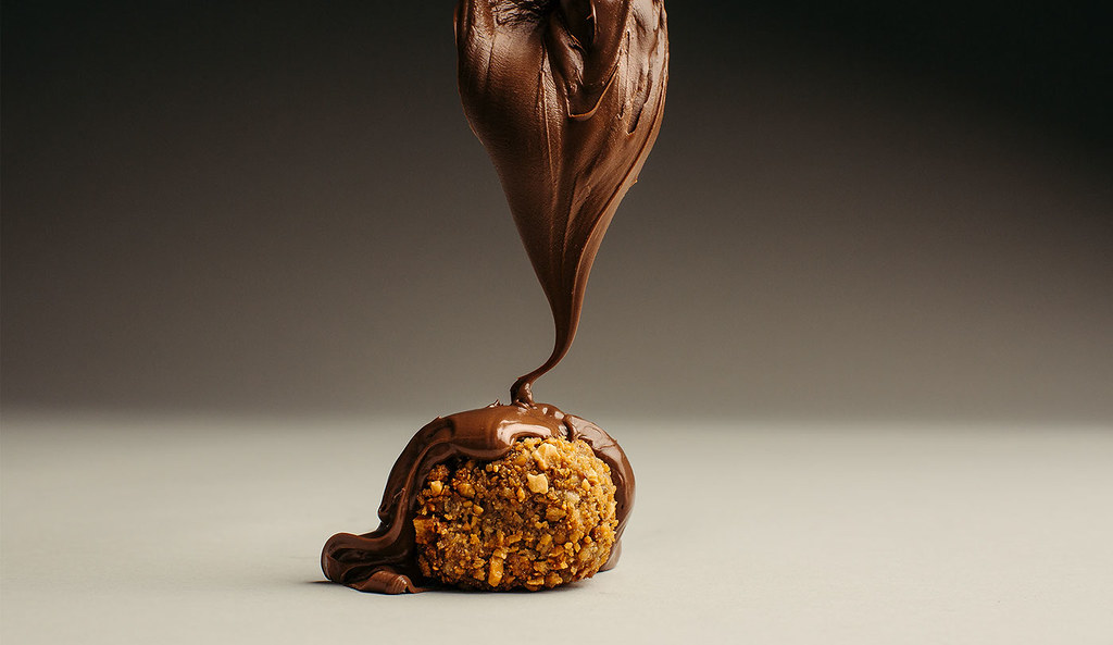
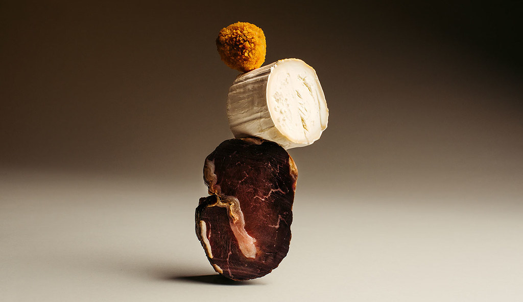
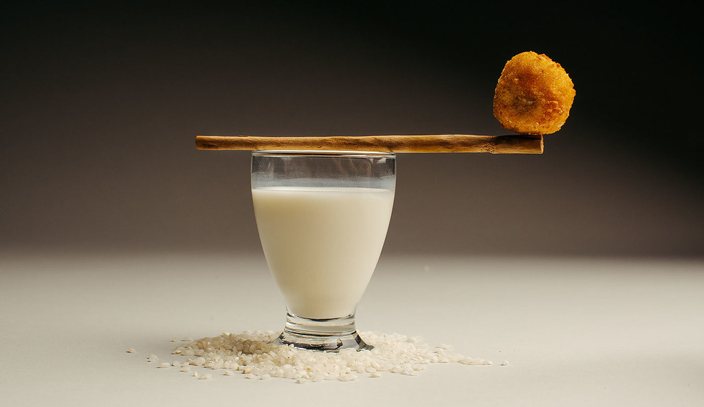
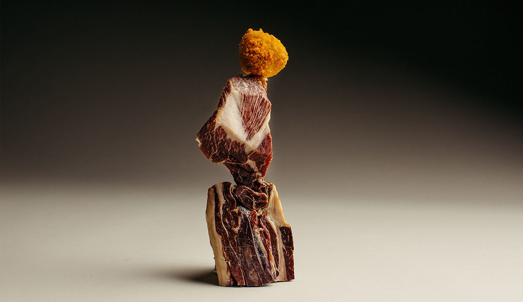
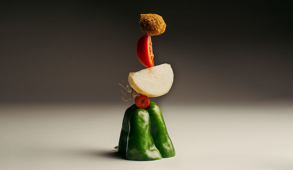
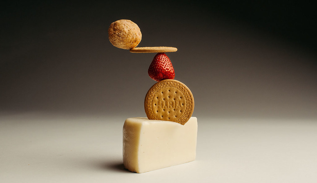
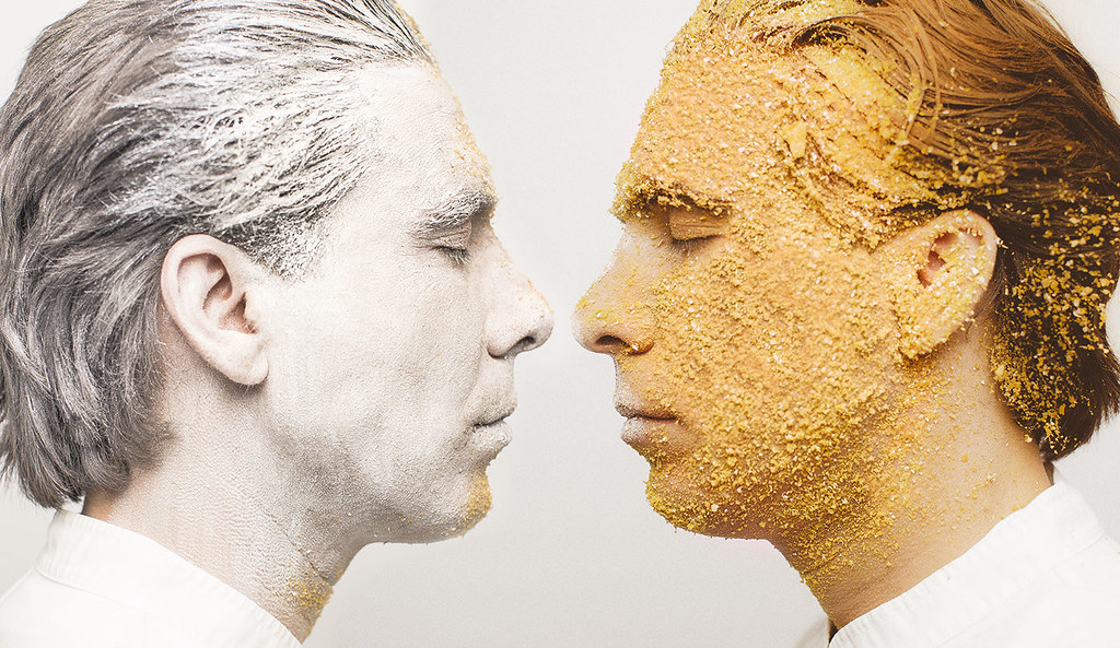
Creoquete es una iniciativa culinaria que busca explotar el lado gourmet de un plato tradicional como las croquetas explorando nuevos sabores de la mano del reconocido chef asturiano Alejandro García Urrutia. El proyecto, desarrollado por Atipo, recurre a un naming descriptivo, distendido y juguetón, cuyo logotipo se une a tres puntos, que a su vez simbolizan los puntos suspensivos (para enlazar con un determinado mensaje) y, en otras ocasiones, representan tres croquetas. Las familias tipográficas empleadas son la Berlingske Serif (Playtype) para el logo y la Geomanist (del propio estudio asturiano) como tipografía secundaria. La línea gráfica está marcada por el contraste de texturas: el crujiente frente a la cremosa bechamel se emplea en la papelería y el packaging en una combinación de cartones y papeles kraft con papeles estucados blancos. El contraste se traslada igualmente a la tienda física mediante dos áreas diferenciadas: una, recubierta en madera, que envuelve el mostrador, y otra, suave y blanca, que conecta con el acceso a la tienda. Finalmente, la presentación del producto huye de la fotografía tradicional y apuesta por mostrar los ingredientes de cada croqueta a modo de escultura en perfecto equilibrio, buscando crear una imagen armónica acorde con un plato sencillo al que se le ha querido dar un punto de «cocina de autor» pero sin perder por ello la sensación de producto asequible.
– –
Creoquete is a culinary initiative looking for exploiting the gourmet side of a traditional dish like croquettes exploring and new flavors with the contirbution of renowned Spanish chef Alejandro García Urrutia. The project, developed by Atipo, uses a descriptive, playful and warm naming, whose logotype joins three points to symbolize the suspension points (that link to a particular message) and represent three croquettes as well. The fonts used are Berlingske Serif (Playtype) for the logo and Geomanist (by this Asturias-based studio) as secondary typeface. The graphic style is defined by the contrast of textures: the crunchy one against creamy bechamel is used in the stationery and packaging through a combination of kraft paper and paperboard with white coated papers. The contrast also describes the physical store by two different areas: the first one, covered in wood, surrounding the bar, and another one, soft and white, which connects to the entrance. Finally, the presentation of the product avoids traditional photography and shows the ingredients of each croquette as a sculpture in perfect balance, trying to create a harmonious line through a simple dish but with a concepto of «haute cuisine» but without losing the sense of affordable product.