
Identidad de Shrewsbury, por &Smith
El estudio londinense &Smith es el responsable de la identidad …

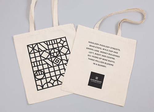
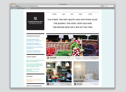
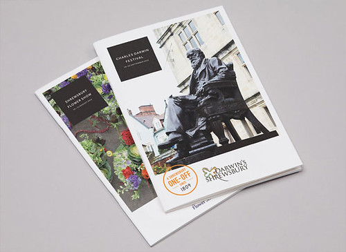
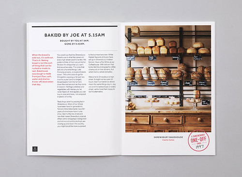
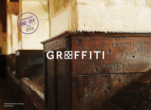
El estudio londinense &Smith es el responsable de la identidad de Shrewsbury, una pequeña e histórica localidad medieval entre Liverpool y Birmingham. El concepto está basado en la arquitectura típica de unos edificios tipo Tudor, con sus características fachadas de madera que trazan formas geométricas y que permiten infinitas combinaciones en las distintas aplicaciones de la identidad, pensadas para ser usadas por cualquier comercio del pueblo.
London-based studio &Smith is the author of the identity for Shrewsbury, a small and historic, medieval town between Liverpool and Birmingham. The concept is based on the typical Tudor-style architecture of its buildings, with their characteristic wood facades that draw geometric forms and let infinite combinations in all the identity applications, aimed to be used by every local business of this town.
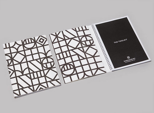
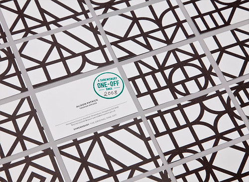
La identidad, basada en la línea como elemento principal, el tipo Effra de Dalton Maag y una armonía acromática, se acompaña de un sello común para promocionar la variada oferta comercial de la ciudad. // The identity is based on the line as the main element, Effra font from Dalton Maag and an achromatic palette, along with a common label to promote the rich commercial offer of the city.


Pingback: And Smith