
Identidad del restaurante La Mamá, por Dani Toranzo
La máxima simplicidad de la línea y la armonía acromática son los atributos gráficos más importantes de la propuesta gráfica de este nuevo establecimiento madrileño.

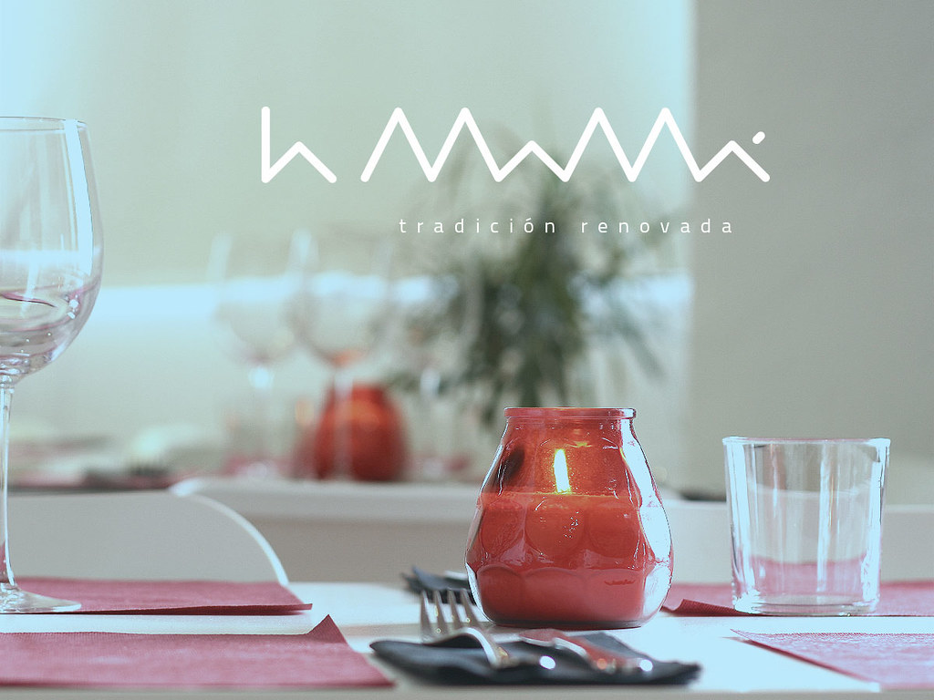
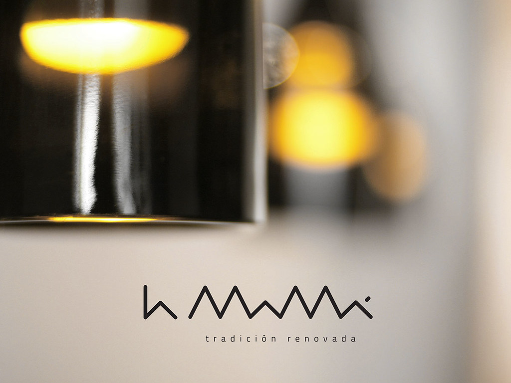
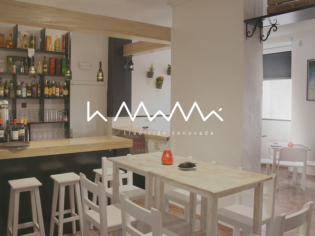
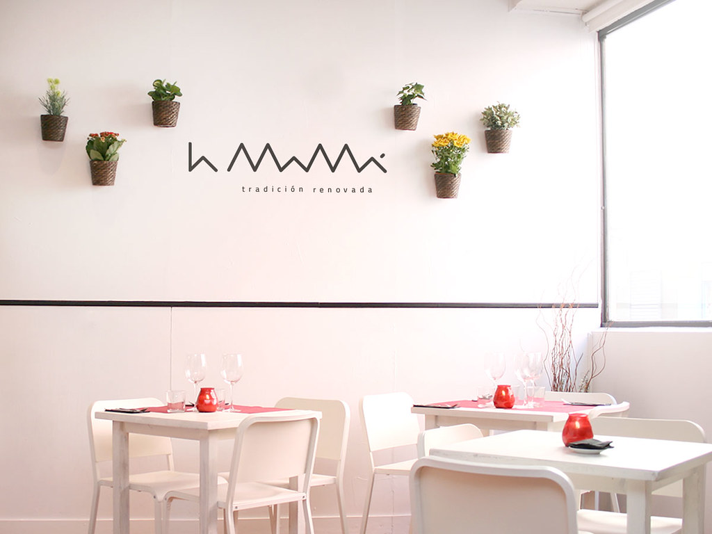
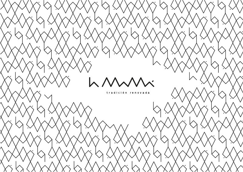
Dani Toranzo (director de arte de OgilvyOne Spain) es el autor de la identidad de La Mamá, un nuevo restaurante madrileño que ofrece recetas tradicionales con un toque renovado. Un logo basado en la máxima síntesis visual, con la línea como elemento único, la Titillium como tipografía del claim y una minimalista armonía acromática (un blanco y negro solo roto por el colorido del local) son los ingredientes plásticos más importantes.
– –
Dani Toranzo (art director at OgilvyOne Spain) is the author of the identity for La Mamá, a new Madrid-based restaurant that offers traditional recipes with a fresh touch. A logo based on the maximum visual synthesis, with the line as the only element, Titillium as the claim typography and a minimalist achromatic palette (a black and white only broken by the color of the establishment) are the most important plastic ingredients.
Admirable conjunción. Sencillez de línea y colores. Bello.