
Identidad visual de The People's Supermarket
The People’s Supermarket es una cooperativa cuya identidad ha sido …
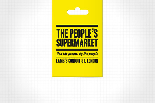
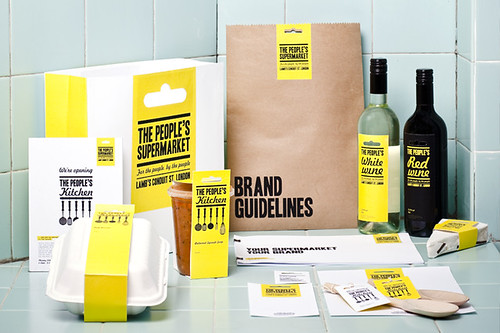
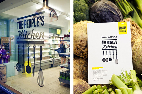
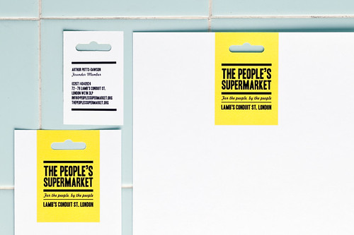
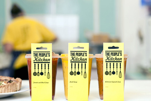
The People’s Supermarket es una cooperativa cuya identidad ha sido diseñada por el estudio londinense Unreal. Para representar carácter «comunitario, asequible y democrático» de la empresa, y teniendo en cuenta el reducido presupuesto de producción, la marca se formaliza a partir de la combinación de tipos bold condensados y de escritura, más desenfadados, aplicación exclusiva del amarillo y negro y del Euroslot (clásico agujero de las etiquetas) como símbolo principal.
The People’s Supermarket corporate identity The People’s Supermarket is a co-operative whose identity has been designed by London-based studio Unreal. To represent its «communal, affordable and democratic» character of the company, and according to the small budget of production, the brand is developed from the combination of bold condensed and handwritten, more casual fonts, the unique application of yellow and black and the Euroslot (the classic hole of the labels) as the main symbol.
Via Identity Designed.


gracias por postear el diseño y el negocio