
IL
Intelligence in Lifestyle (IL) es una revista relativamente nueva (nació …
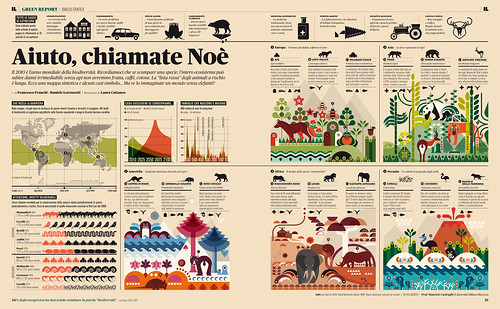
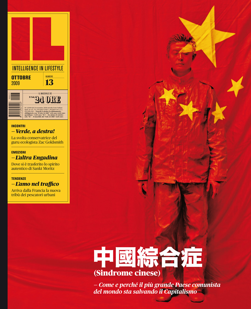
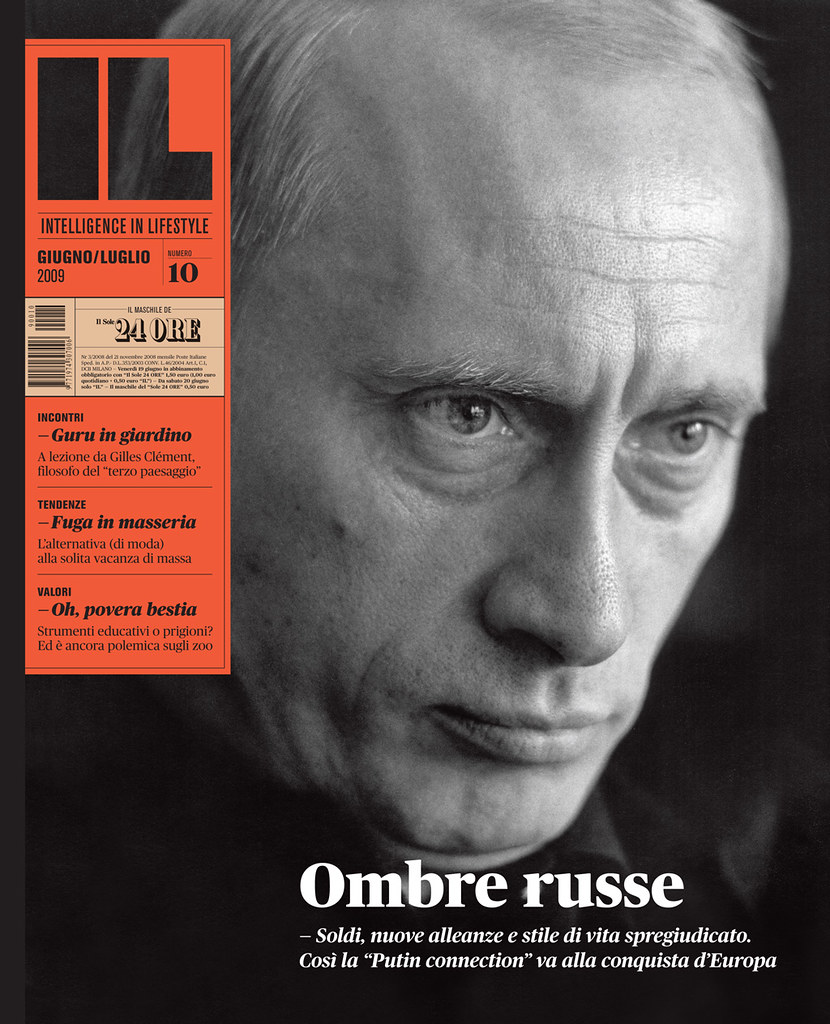
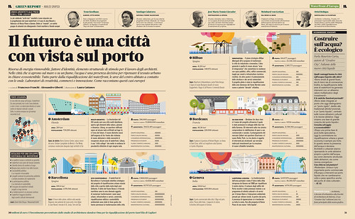
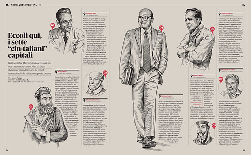
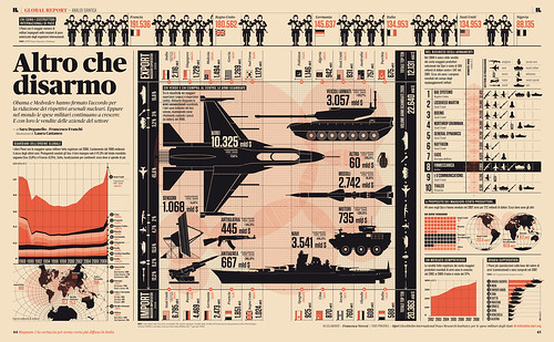
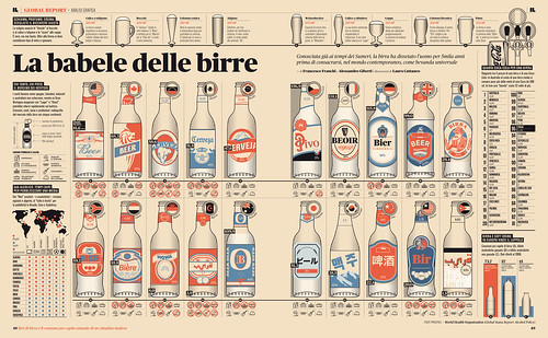
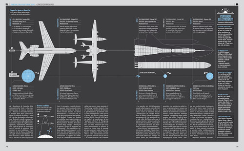
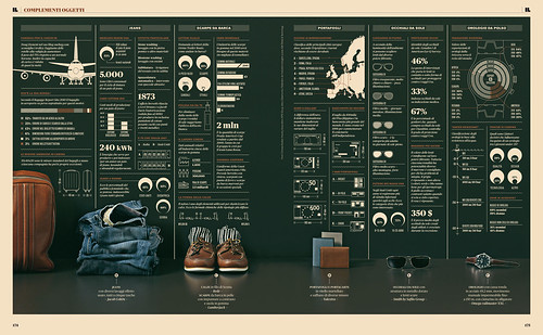
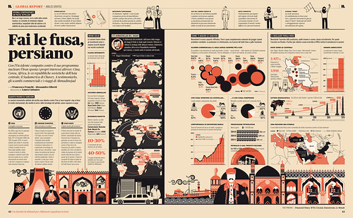
Intelligence in Lifestyle (IL) es una revista relativamente nueva (nació en 2008 como suplemento del diario italiano Il Sole 24 Ore), «inspirada en el racionalismo suizo, las revistas de moda y las publiaciones italianas y noreuropeas de los 70» (en palabras de Colorcubic), con gran peso de la infografía y con el tipo Publico (una serifa perteneciente a la fundición Commercial Type y diseñada por Paul Barnes y Christian Schwartz) como estandarte. Existe también una galería en Flickr.
Intelligence in Lifestyle (IL) is a relatively new journal (it was born in 2008 as a supplement of the Italian newspaper Il Sole 24 Ore), «inspired by Swiss rationalism, fashion magazines and the Italian and Northen European periodicals from the 70s» (according to Colorcubic), with great relevance of infographics and Publico (a serif font released under Commercial Type foundry and designed by Paul Barnes and Christian Schwartz) as one of its symbols. I also has a gallery on Flickr.
Via Typographicartstuff.
Pingback: Tweets that mention Infografía y el tipo Publico, claves de la revista IL | Cosas Visuales -- Topsy.com
Increíble trabajo, uno de los mejores que he visto! cómo puedo conseguir una edición, me gustaría mucho hojearla.