
Packaging de Cook, por Love
Una combinación de ilustraciones xilográficas, un tono suave y un …
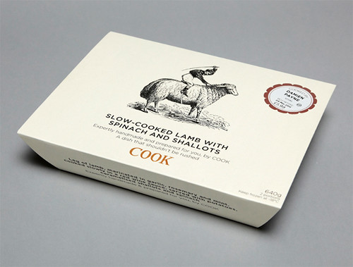
Una combinación de ilustraciones xilográficas, un tono suave y un interesante juego tipográfico (con la Gotham como protagonista) son los criterios visuales principales del packaging de Cook (productos congelados de gran calidad), diseñados por Love. // Cook packaging, by Love A combination of woodcut illustrations, a soft tone and an interesting typographic play (with Gotham as the protagonist) are the main visual criteria of Cook (high quality prepared meals), designed by Love.
Via The Best Part.