
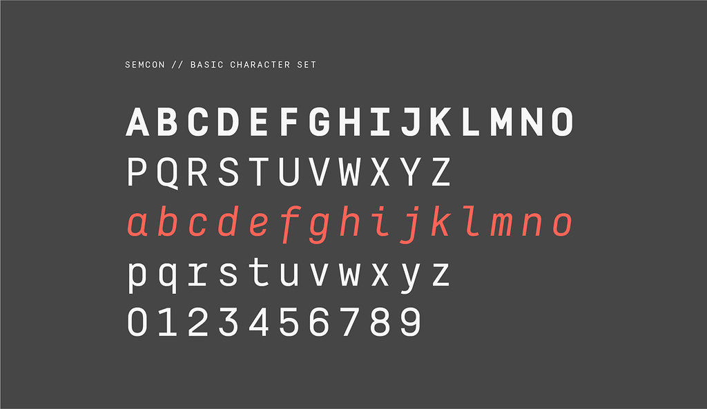
Semcon, la nueva familia tipográfica de Atipo
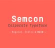
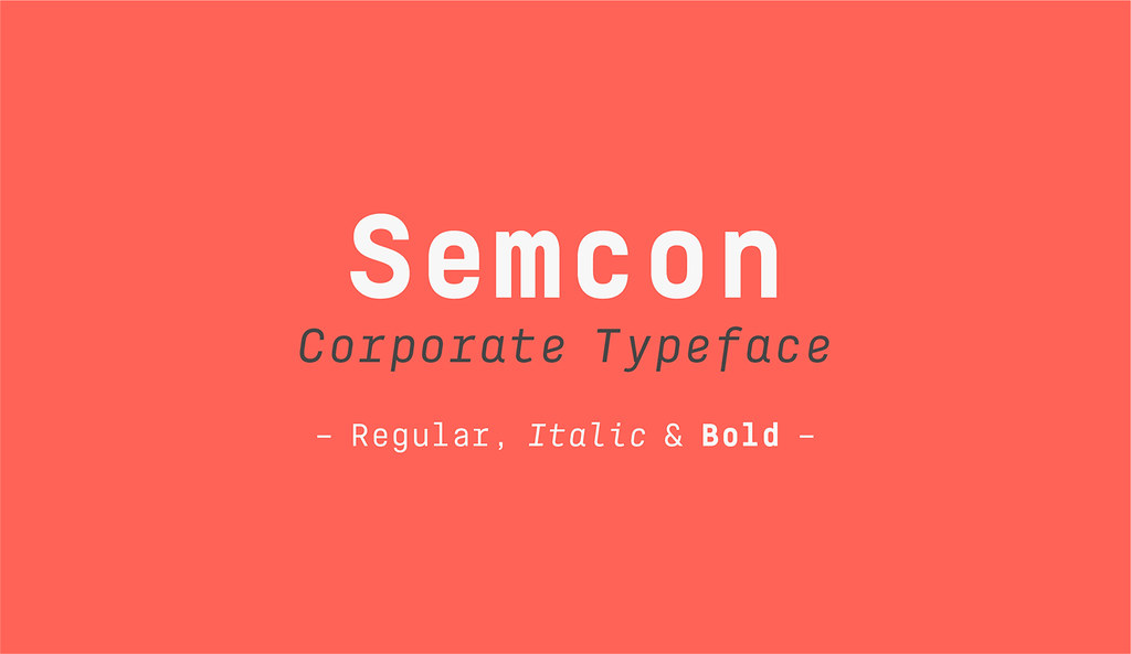
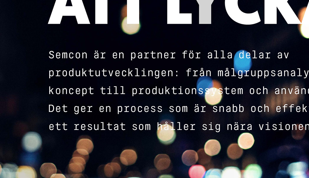
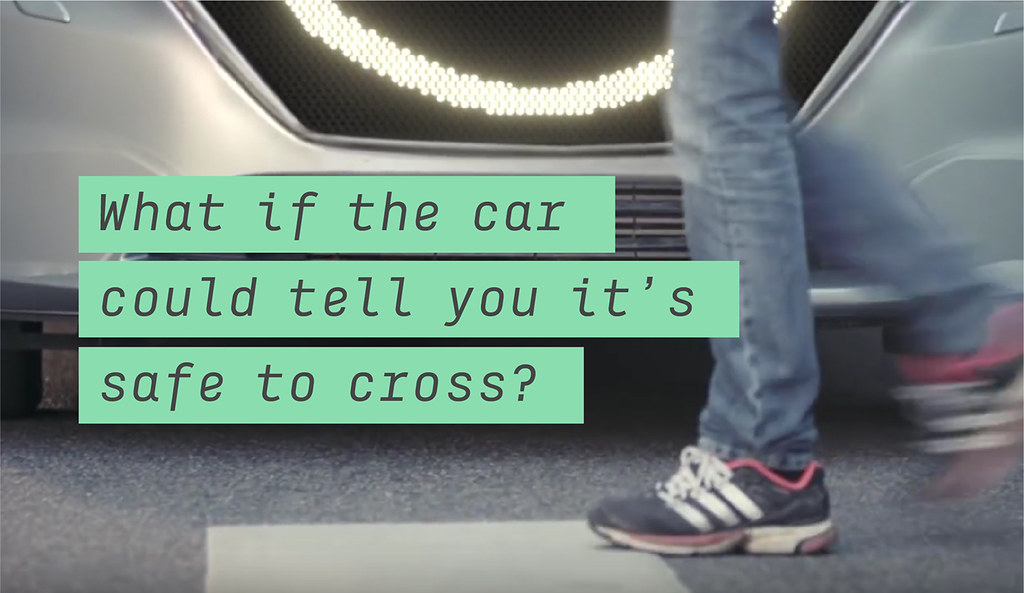
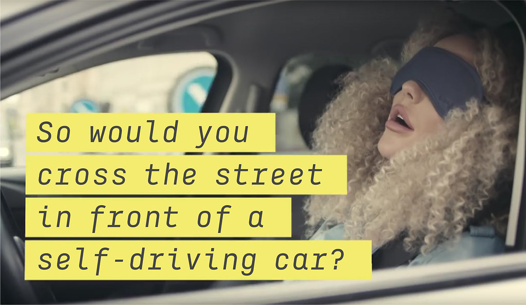
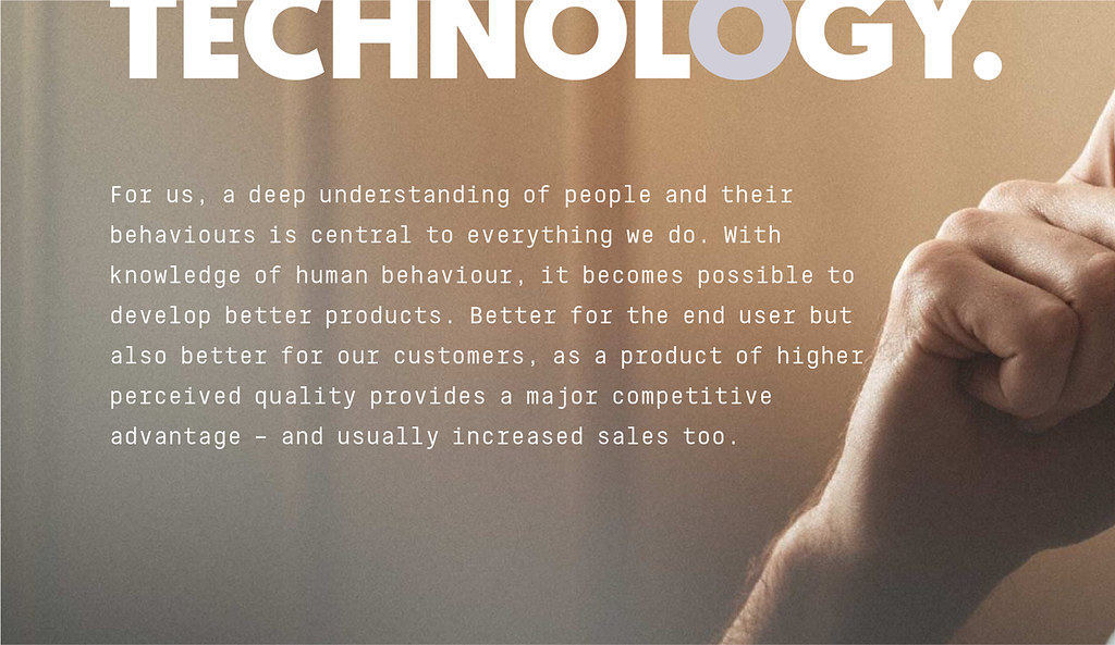
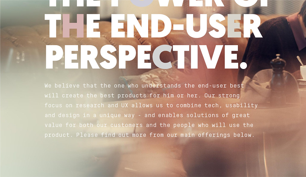
Atipo acaba de lanzar una nueva familia tipográfica para Semcon, una empresa sueca dedicada a la ingeniería y la tecnología. Bajo la dirección de Forsman & Fodenfors (la multipremiada agencia sueca que ha desarrollado la nueva identidad), el trabajo del estudio asturiano se compone de dos acciones: por un lado, una versión customizada del peso black de la geomanist, para su uso en titulares; y, en segundo lugar, una familia nueva de tres pesos (regular, italic & bold), con un aire más tecnológico, pensada para tamaños medios y bloques de texto. La familia tipográfica se utiliza tanto en el sitio web corporativo como en la campaña realizada para el último producto de semcon, the smiling car (ver vídeo más abajo).
– –
Atipo has just launched a new typeface family for Semcon, a Swedish company dedicated to engineering and technology. Under the direction of orsman & Fodenfors (the Swedish award-winning agency that developed the new identity), the work of the Asturias-based studio consists of two actions: firstly, a customized version of geomanist‘s black weight, used in headlines; and, secondly, a new family of three weights (regular, italic & bold), with a more technological air, designed for media sizes and body texts. The typeface family is used both in the corporate website and in the campaign for Semcon’s latest product, the smiling car (see video below).
[youtube]https://www.youtube.com/watch?v=INqWGr4dfnU[/youtube]